
@*$(&ing Color!
In case anyone else has the same problem I thought I would share what I do to wrap my head around color when I fall:
MASTER COPIES. What are master copies you ask? I find a piece by one of my favorite illustrators, and paint a copy in whatever media I’ve been working in lately. When I am struggling with color I find it helpful to recreate illustrations that handle color in an inspiring or tricky way that I’d like to understand better. Doing master copies always teaches me something about how my heroes created their work. I also learn that I am capable of techniques I never thought I was. Master copies open my mind, and boost my confidence ever so slightly. (“Oh! Okay, I guess I CAN paint like <INSERT FAMOUS ILLUSTRATOR HERE>. I just don’t, because that’s their thing and I need to do my thing.”). There is no shame in doing master copies, but I would never share my master copies on the internet. (OMG. I might actually die of embarrassment if that ever happened.) Visual artists all look at and are inspired by each other. It’s what you do with that inspiration that separates the copiers from the artists. Know your influences, carry them close, even use them from time to time. But don’t use them as crutches, and always be open to new influences from any myriad of places. After doing a handful of master copies and feeling like I can re-tackle my own ideas I usually need to reset my color workspace. I do this by:
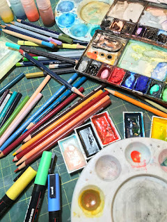
CREATING A LIMITED COLOR PALETTE. I am usually overwhelmed with choices when I look at my color palette. Through the years I have collected hundreds of colors. (and yet I don’t get rid of any because “WHAT IF I NEED IT SOMEDAY??????”). This glut of choices inevitably confuses me, and I end up creating artwork that looks like The Joker decided to take up finger painting. In order to avoid the chaotic mess that ensues I have taken to selecting three colors, plus white and black. Those colors make my palette no matter what. I can mix other colors from those three colors, but those are the three I need to work with. for. the. entire. piece. no. exceptions. “But what if I NEED orange?? There’s a pumpkin in my painting!!” Guess what? Color is dependent upon the light and environment it is in. The pumpkin doesn’t actually need to be orange. If the orangest color you can come up with is brown then that brown will probably look pretty orange in the weird color world you have created. Also, we’re illustrators! We get to play with reality. We can get crazy with color, skies can be orange, grass can be blue, pumpkins can be brown. PLAY. But! This brings me to my final point:
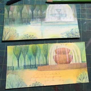
MAKE COLOR STUDIES before moving to final. This is the rule that I break more often than any other. UGH. “You mean I need to try out colors beforehand and do multiple versions???” Yes. Yes, that’s exactly what I mean, Margaux Meganck. I like to make my color studies small (business card sized) so they are an insignificant time investment. And they don’t need to be detailed or readable to anyone but me. The point is to try out all those crazy color combinations, and see what actually works. That way when I move on to final I kinda sorta know maybe what I’m doing and the chances of having an artistic tantrum* are slim to none. *Artistic tantrum: where I end up tearing apart a piece of final art. Yes, this has happened before. But not for a while. I am a totally stable adult now. ;)
- These steps may not work for you. But I hope talking about my struggles with color can help others with similar issues figure out what works for them. Happy coloring!
Some more cool resources for color:
-Color and Light: a Guide for the Realist Painter by James Gurney. Good info for non-realist painters too!
- Color Mixing Manual by John Barber. Invaluable for creating limited palettes!
- Pinterest or a desktop file for gathering inspirational images for master copies or color palette inspo.
-Design-Seeds is a cool website for finding color palettes by beautifully curated images.
- Adobe Capture is a phone app that lets you pull palettes from your own photos!
Article originally appeared on https://hellosmallempire.com/ an illustrators collective.


Comments
Post a Comment